By Saskia O. | November 3, 2019
I wrote the following R Code for an Integrated Trend Analysis (ITA) during my PhD thesis in 2010, when I attended for the first time the annual meeting of the ICES/HELCOM Working Group on Integrated Assessments of the Baltic Sea (WGIAB). The code helped running a cross-comparison of several Baltic Sea sub-systems (see the 2010 report1). Together with Rabea Diekmann we fine-tuned the code and published it along with a full description on ITA methods in a Book chapter2 in Climate Impacts on the Baltic Sea: From Science to Policy. Since then I’ve seen the code being used for several ITAs of other systems, particularly the Traffic Light Plot dispite the fact that there are better heatmap packages out there, which honestly make much nicer graphs.
So for everyone who doesn’t have access to the Book chapter (if you are interested you could request it from me), I’ll have posted here the code but without the full method description as provided in the book chapter.
But please note that
- this code is rather old and stems from my earlier R coding attempts so there surely will be better functions or packages available that could implement this analysis simpler or faster.
- this code represents only one approach of conducting an ITA, which is the approach of the WGIAB and some other ICES Integrated Ecosystem Assessments (IEA) working groups in former years.
- the methods applied here are not comprehensive and do not comprise all necessary or possible techniques for identifying joint shifts in the time series. A thorough data exploration always needs to take place beforehand to decide which transformations are necessary and which are the most appropriate tools to analyse the time series.
- the Principal Component Analysis (PCA) applied here on the full dataset should be rather split into state and pressure variables (i.e. into biological and environmental variables)! Also, the PCA has been recently discusses as being inappropriate for identifying joint changes in time series data (see Planque & Arneberg, 20183). So you should consider replacing this step with alternative methods such as Dynamic Factor Analysis (for details on this methods see this useful online book chapter).
Table of Contents
- 1. Data exploration
- Ordination method: Principal Component Analysis (PCA)
- 3. Clustering method: Constrained Clustering
The following code is run on a dummy dataset comprising of 5 biological time series (2 fish species, 2 zooplankton species and 1 phytoplankton group) and 4 environmental time series (nutrient concentrations, temperature and salinity and a large-scale climate index, i.e. the North Altantic Oscillation Index NAP) for the period 1979-2006:
Data <- read.table("data/ita_data.txt", header = TRUE)
str(Data)
## 'data.frame': 28 obs. of 10 variables:
## $ Year : int 1979 1980 1981 1982 1983 1984 1985 1986 1987 1988 ...
## $ FishA : int 579671 696743 666132 670941 645258 657667 544911 399372 320471 299277 ...
## $ FishB : int 386000 249000 222000 279000 418000 585000 543000 495000 409000 370000 ...
## $ ZooA : num NA 6.72 1.73 8.65 3.42 ...
## $ ZooB : num NA 113.1 44.2 85.6 21.8 ...
## $ PhytoA : num 2.76 1.35 4.6 2.33 1.77 ...
## $ NutrientsA: num 3.42 4.39 3.9 4.04 5.23 ...
## $ NAO : num -2.25 0.56 2.05 0.8 3.42 1.6 -0.63 0.5 -0.75 0.72 ...
## $ Temp : num 5.83 5.24 4.71 5.66 7.59 ...
## $ Salinity : num 7.58 7.53 7.49 7.31 7.35 ...1. Data exploration
1.1 Data distribution
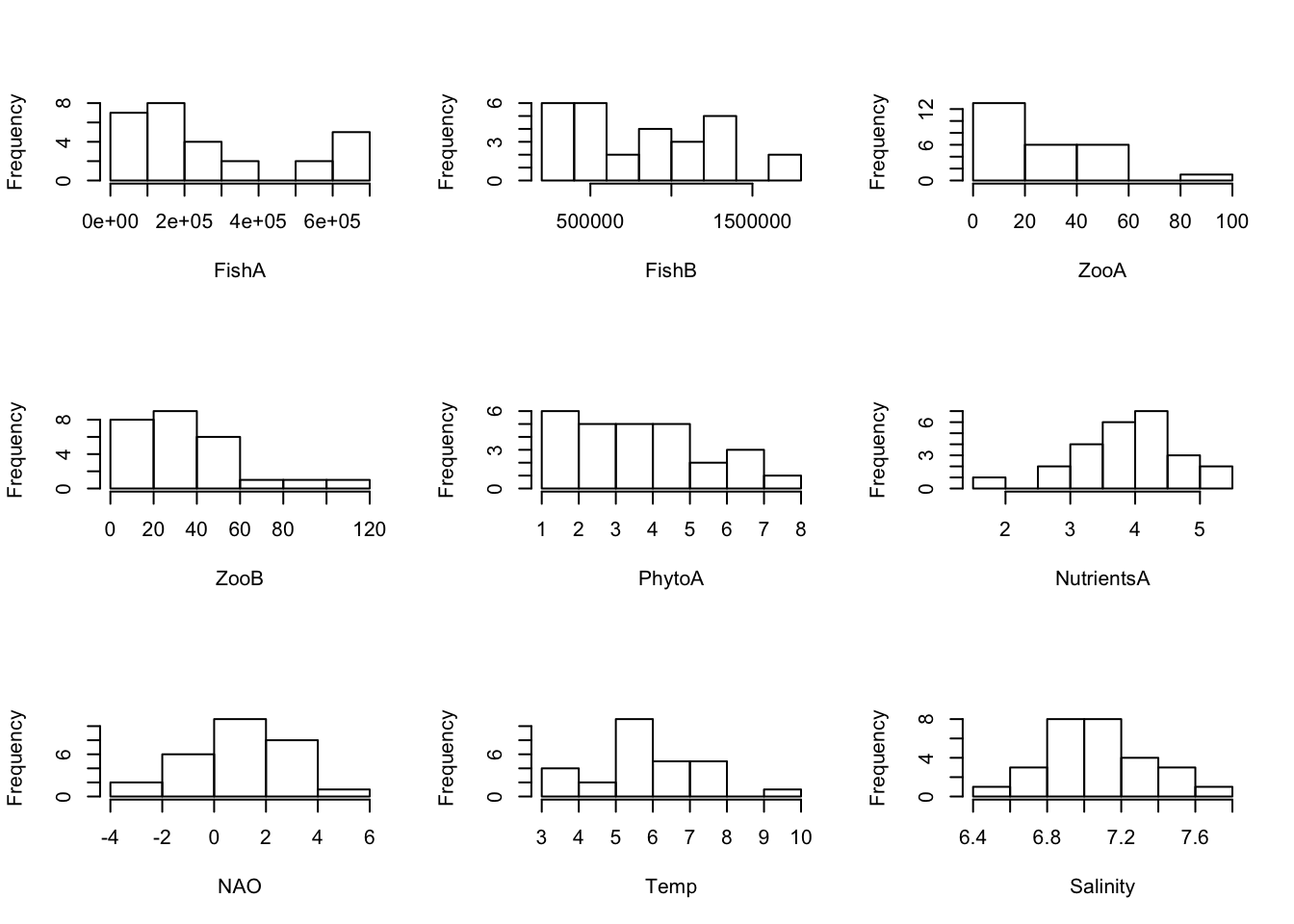
Although normal distribution is not a prerequisite for the following analyses, the visual inspection of the data distribution is useful. Very often biological data are clearly right-skewed, whereas many physical parameters show a close-to-normal distribution. To linearise the relationships between variables and reduce the relationship between the variance and the mean, some variables most likely need a transformation.
Untransformed data:
# Create Histograms for each variable (using a loop)
par(mfrow = c(3, 3))
for(i in 2:dim(Data)[2]) {
  hist(Data[ ,i], main = "", xlab = colnames(Data)[i])
}
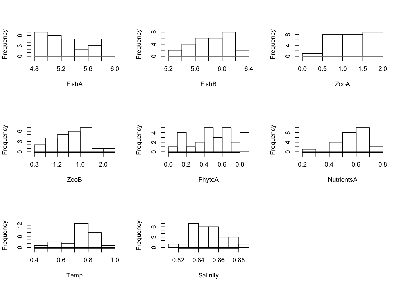
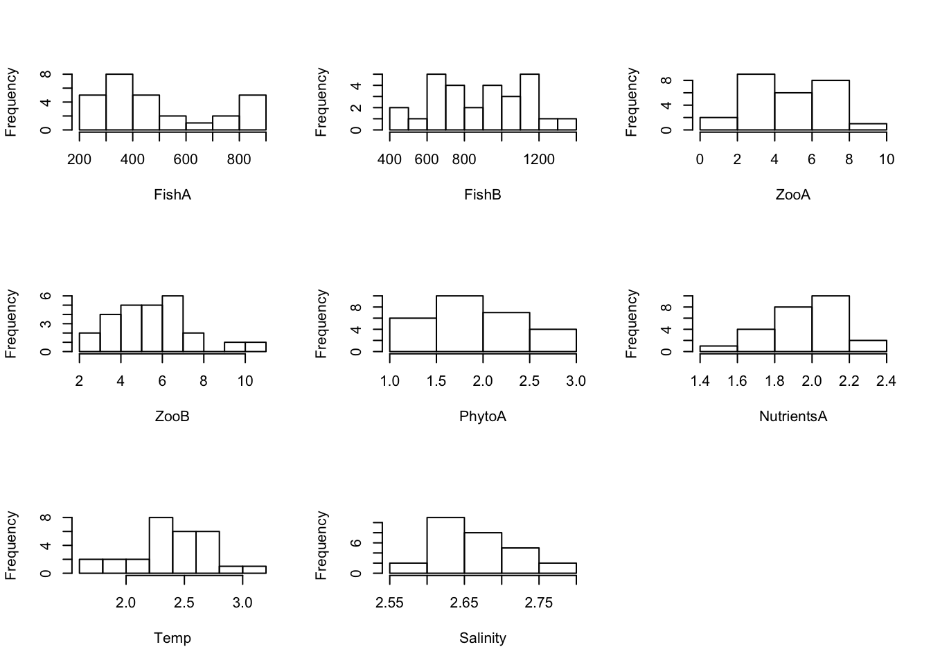
Log10- and sqrt-transformed data:
For a PCA, transformations of some variables may be necessary → When transformations are applied, repeat checking the distributions: Here, two examples are given with using a log(x+0.001) to the base of 10 and a root-transformation for all variables (usually needed only for some). But be aware that for log- and sqrt-transformation, values have to be > 0 or >= 0 respectively (so the transformation of the NAO is not possible):
# Create Histograms for each log10-transformed variable (using a loop, excluding NAO)
par(mfrow = c(3,3))
for(i in c(2:7, 9:10)) {
  hist(log(Data[ ,i] + 0.001, 10), main = "", xlab = colnames(Data)[i])
}
# Create Histograms for each root-transformed variable (using a loop, excluding NAO)
par(mfrow = c(3,3))
for(i in c(2:7, 9:10)) {
  hist(sqrt(Data[ ,i]), main = "", xlab = colnames(Data)[i])
}
1.2 Linearity in relationship and correlation
The following plots and analysis are shown for completeness: Because PCA is a linear method, sometimes we like to check whether the variable relationships are linear, unimodal or any other shape. Usually you can use pairplots for this purpose. However, if the number of variables is high this is not always a good option. Then do single scatterplots and a correlation matrix:
Pairplot showing additionally the histograms, correlation coefficients and a regression line:
# Some add-on functions to show in the pairplot
panel_cor <- function(x, y) {
  par(usr = c(0, 1, 0, 1))
  r <- cor(x, y,use = "pairwise.complete.obs")
  txt <- format(r, digits = 1)
  text(0.5, 0.5, txt, cex = 0.9/strwidth(txt) * abs(r))
}
panel_lines <- function (x, y) {
  points(x, y, bg = NA, cex = 1)
  sel <- is.finite(x) & is.finite(y)
  if (any(sel)){
    lml <- lm(y[sel] ~ x[sel])
    abline(lml, col = "blue")}
}
panel_hist <- function(x) {
  usr <- par("usr")
  par(usr = c(usr[1:2], 0, 1.5) )
  h <- hist(x, plot = FALSE)
  breaks <- h$breaks
  nB <- length(breaks)
  y <- h$counts / max(h$counts)
  rect(breaks[-nB], 0, breaks[-1], y, col="grey80")
}
# Excluding Year in the pairplot
pairs(Data[ , -1], lower.panel=panel_lines,
      upper.panel=panel_cor, diag.panel=panel_hist)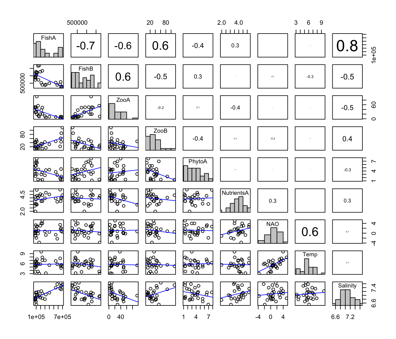
# Now with all biological variables log10-transformed
LogData <- Data
for(i in c(2:6)) {
    LogData[ ,i] <- log(LogData[ ,i] + 0.001, 10)
}
pairs(LogData[ , -1], lower.panel=panel_lines,
      upper.panel=panel_cor, diag.panel=panel_hist)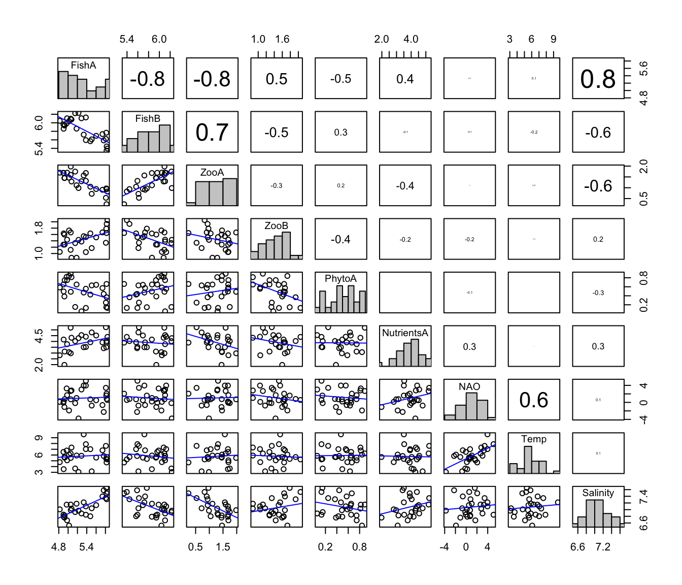
Single Scatterplots If all possible scatterplots should be investigated, the following code can be used including a smoothing line (lowess) (plots are not shown here)
par(mfrow=c(4,4), mar=c(4,4,1,1), tcl=-0.2)
for(i in 2:(dim(Data) [2])) {
  for(j in i:(dim(Data) [2])) {
    plot(Data[,i],Data[,j], xlab=colnames(Data)[i], ylab=colnames(Data)[j])
    lines(panel.smooth(Data[,i],Data[,j]), col="red")
  }}
The correlation matrix for all variables:
cor(Data[2:dim(Data)[2]], Data[2:dim(Data)[2]],
   method="pearson", use="pairwise.complete.obs")
## FishA FishB ZooA ZooB PhytoA
## FishA 1.00000000 -0.70130076 -0.64534876 0.62125994 -0.44906514
## FishB -0.70130076 1.00000000 0.58558653 -0.48966855 0.30660884
## ZooA -0.64534876 0.58558653 1.00000000 -0.23578928 0.12124821
## ZooB 0.62125994 -0.48966855 -0.23578928 1.00000000 -0.39796352
## PhytoA -0.44906514 0.30660884 0.12124821 -0.39796352 1.00000000
## NutrientsA 0.29220455 -0.04199256 -0.36156392 -0.13570337 0.06822180
## NAO 0.01714005 -0.13095245 0.03295777 -0.16996758 -0.04554554
## Temp 0.04162070 -0.25263775 -0.03668616 -0.05913682 0.03486569
## Salinity 0.81544737 -0.50698217 -0.45016841 0.37308476 -0.27106491
## NutrientsA NAO Temp Salinity
## FishA 0.29220455 0.01714005 0.04162070 0.8154474
## FishB -0.04199256 -0.13095245 -0.25263775 -0.5069822
## ZooA -0.36156392 0.03295777 -0.03668616 -0.4501684
## ZooB -0.13570337 -0.16996758 -0.05913682 0.3730848
## PhytoA 0.06822180 -0.04554554 0.03486569 -0.2710649
## NutrientsA 1.00000000 0.28539400 -0.02569801 0.2718115
## NAO 0.28539400 1.00000000 0.63859296 0.1141806
## Temp -0.02569801 0.63859296 1.00000000 0.0993519
## Salinity 0.27181154 0.11418063 0.09935190 1.00000001.3 Temporal anomalies of original data
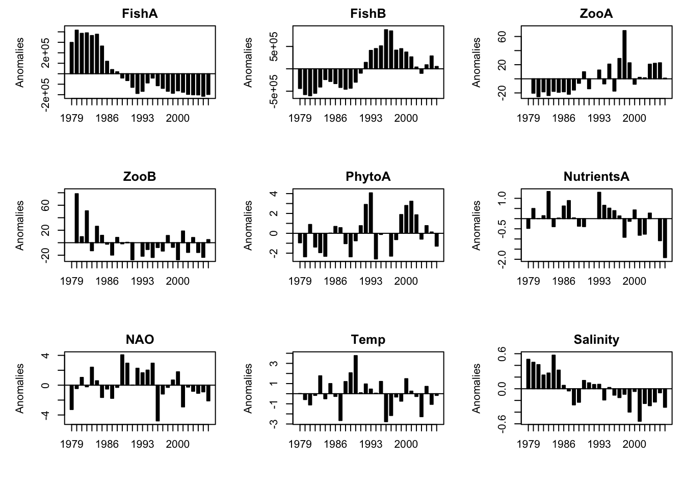
The temporal dynamics of variables can be presented in various ways. Here is the R-code for barplots using deviations from the mean \(z_{i} = x_{i}-\bar{x}\).
Create dataset containing the anomaly values:
AnomData <- Data
# Save the dimensions (number of rows[1] and columns[2] ) in a vector
n <- dim(AnomData)
# Loop to convert actual values into anomaly values (incl. missing
# values in the average- and anomaly-calculation); the loop starts with the
# second column to exclude "Year" (no variable) and ends with the last column
# (defined by the second element of the vector n (n[2]) )
for (i in 2:n[2]) {
  AnomData[ ,i] <- AnomData[ ,i] - mean(AnomData[ ,i], na.rm = TRUE)}
(Note: If you want to substract the mean as I did here, you could also simply use the scale() function)
Plot anomalies as barplot:
# First, the limits of the y-axes (ylim) are defined by calculating the minimum
# and maximum anomaly of each variable
y.low <- apply(AnomData, MARGIN = 2, FUN = min, na.rm = TRUE)
y.low <- y.low+1/10*y.low
y.upp <- apply(AnomData, MARGIN = 2, FUN = max, na.rm = TRUE)
y.upp <- y.upp+1/10*y.upp

par(mfrow = c(3,3), mar = c(5,5,2,1))
for(i in 2:dim(AnomData)[2]) {
  barplot(AnomData[ ,i], col = "black", space = 0.7,
          ylim = c(y.low[i], y.upp[i]), axis.lty = "solid",
          names.arg = AnomData$Year, axisnames = TRUE,
          ylab = "Anomalies", main = colnames(AnomData [i]))
  box(lty = "solid", col = "black")
  # creates a horizontal reference line at y = 0
  abline(a = NULL, b = NULL, h = 0, v = NULL, reg = NULL,
         coef = NULL, untf = FALSE)
}
1.4 Traffic light plot of original data
Data preparation: Convert actual values into ranks based on quintiles and place the Year column at the end.
# Place Year column at end
Data2 <- Data[ ,c(2:ncol(Data), 1)]
names(Data2)
## [1] "FishA" "FishB" "ZooA" "ZooB" "PhytoA"
## [6] "NutrientsA" "NAO" "Temp" "Salinity" "Year"# Save the dimensions (number of rows[1] and columns[2] ) in a vector
n <- dim(Data2)
# Get names for the plot axes
# the y-axis (without the last column (years) )
Variablenames <- names(Data2)[-n[2]]
# the x-axis
Years <- Data2[ ,n[2]]
# Generate a matrix containing the quintile values for each variable
# (exluding the time vector by setting the column number and loop end to n[2] -1)
Quintiles <- matrix(nrow = 5, ncol = n[2]-1, byrow = FALSE)
for (i in 1:(n[2]-1)) {
Quintiles[, i] <- quantile(Data2[,i],
probs = c(0.2, 0.4, 0.6, 0.8, 1.0), na.rm = TRUE)
}
# Generate a dataframe where original values are converted
# into code 1 to 5 (depending on the quintile) using two loops:
# first create new dataframe based on the orignal dataframe
CodedData <- Data2
# then convert the actual values into codes using a loop:
# the first (outer) loop repeats process for every variable,
# the second (inner) loop repeats process for every element within
# a variable
for(j in seq(along = CodedData[1:(n[2]-1)])) {
for(i in seq(along = CodedData[[j]])) {
if(is.na(CodedData[[j]][i]) == TRUE) {
is.na(CodedData[[j]][i])<- TRUE} else
if(CodedData[[j]][i] < Quintiles[1,j]) {
CodedData[[j]][i]<-1} else
if((CodedData[[j]][i] >= Quintiles[1,j]) &&
(CodedData[[j]][i] < Quintiles[2,j])) {
CodedData[[j]][i]<-2} else
if((CodedData[[j]][i] >= Quintiles[2,j]) &&
(CodedData[[j]][i] < Quintiles[3,j])) {
CodedData[[j]][i]<-3} else
if((CodedData[[j]][i] >= Quintiles[3,j]) &&
(CodedData[[j]][i] < Quintiles[4,j])) {
CodedData[[j]][i]<-4} else
if(CodedData[[j]][i] >= Quintiles[4,j]) {
CodedData[[j]][i]<-5} }
} Plot preparation: To order variables in the plot in accordance to the standardised variable averages over the first five data points (excluding the Year column):
# First create vector
Avg5year <- vector(length = n[2]-1)
# Then fill the vector with the standardised variable averages over the
# first five data points (mean of first 5 years - mean of full time series/
# standard deviation of full time series)
for (i in 1:(n[2]-1)) {
    Avg5year[i] <- (mean(Data[c(1:5), i], na.rm = TRUE) -
        mean(Data[, i], na.rm = TRUE)) /
        sd(Data[, i], na.rm = TRUE) }
# Finally, order the variable and create an index vector
OrdVar <- order(Avg5year)
# To sort coded dataframe in accordance to the 5-year standardised
# average, use the vector OrdVar as an index
CodedData.sorted <- CodedData[ ,c(1:n[2]-1)][OrdVar]
# Convert dataframe into a matrix (necessary for an image plot)
CodedData.mat <- as.matrix(CodedData.sorted)
One can sort the variables in many ways actually, e.g. using the scores from ordination techniques such as the PCA, but this above approach is less transformed as it sorts by the original values!
Image plot: Colours can be easily adjusted;, also the axes titles in case you have a different time vector and/or will use a different sorting procedure:
x <- c(1:n[1])
y <- c(1:(n[2]-1))
par(mar = c(4,5,3,6), oma = c(0.5,2,0,0), xpd = TRUE)
image(x, y, z = CodedData.mat, zlim = c(1,5),
      col = c("green", "yellowgreen", "yellow", "gold", "red"),
      axes = FALSE, xlab = "Years", ylab = "")
axis(1, at = seq(1, n[1], by = 1), tick = FALSE, labels = Years,
     cex.axis = 0.7, las = 3)
axis(2, at = seq(1, (n[2]-1), by = 1), tick = FALSE,
     labels = Variablenames[OrdVar],
     cex.axis = 0.7, las = 1, padj = 1)
box()
mtext("Variables (sorted by the 5-year standardised average)",
      outer = TRUE, side = 2, cex = 0.8)
legend(x = max(x)+1, y = max(y), legend = c("< 0.2 quintile",
                                            "< 0.4 quintile", "< 0.6 quintile", "< 0.8 quintile",
                                            "> 0.8 quintile", "missing value"),
       fill = c("green", "yellowgreen", "yellow", "gold", "red", "white"),
       cex = 0.6, bty = "n")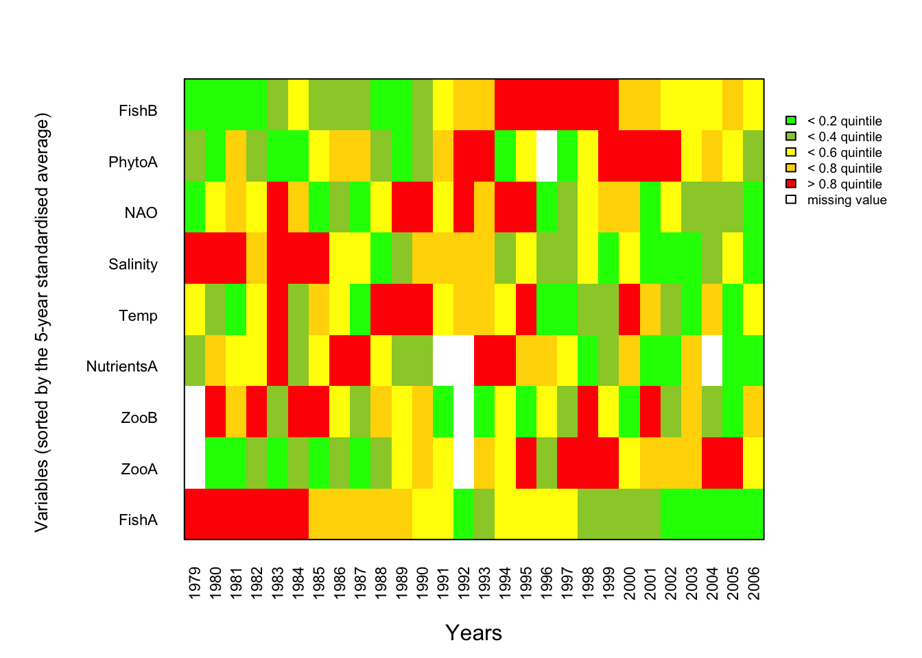
Ordination method: Principal Component Analysis (PCA)
Data preparation: For the following PCA, missing values need to be replaced. There are different imputation methods, here we will replace NAs with averages of the 2 previous and 2 following years. Further, some variables need to be previously transformed, e.g. by logarithmic transformations to linearise the relationships (in this dummy dataset the biological variables).
Data.transf <- Data
# Save the dimensions (number of rows[1] and columns[2] ) in a vector
n <- dim(Data.transf)

# Function to replace NAs with 4-yr average (or less depending on position of NA)
fill_na <- function(x) {
    loc.na <- which(is.na(x))
    n <- length(x)
    for(i in loc.na) {
         d <- n - i
            if(i == 1) x[i] <- mean(x[c(i+1, i+2)], na.rm = TRUE)
            if(i == 2) x[i] <- mean(x[c(i-1, i+1, i+2)], na.rm = TRUE)
            if(i >= 3) {
                    if(d >= 2) x[i] <- mean(x[c(i-2, i-1, i+1, i+2)], na.rm = TRUE)
                    if(d == 1) x[i] <- mean(x[c(i-2, i-1, i+1)], na.rm = TRUE)
                    if(d == 0) x[i] <- mean(x[c(i-2, i-1)], na.rm = TRUE)
        }
    }
    return(x)
}

# Apply function
for(i in 2:n[2]) {
    Data.transf[ ,i] <- fill_na(Data.transf[ ,i])
}

# Log10-transform biological variables
for(i in 2:6) {
    Data.transf[ ,i] <- log(Data.transf[ ,i] + 0.001, 10)
}
PCA and numerical output
We will apply a PCA based on the correlation matrix using the function vegan::rda()
# Load package
library(vegan)

# Use all rows but exclude the 'Year' column in the PCA --> [ ,c(2:n[2])]
# To use the correlation matrix, set scale = TRUE)
PCA.vegan <- rda(Data.transf[, -1], scale = TRUE)

# Obtaining eigenvalues
PCA.vegan.eigen <- PCA.vegan$CA$eig
PCA.vegan.eigen
## PC1 PC2 PC3 PC4 PC5 PC6
## 3.70377351 1.87105958 1.28927194 0.89014022 0.45089884 0.34988099
## PC7 PC8 PC9
## 0.28373765 0.09753584 0.06370144# the summary gives the eigenvalues, explained variance, cumulative variance,
# loadings (species scores) and scores (site scores, which are scaled by a
# a constant given in the output)
PCA.vegan.sum <- summary(PCA.vegan)
PCA.vegan.sum # displays summary output in R console##
## Call:
## rda(X = Data.transf[, -1], scale = TRUE)
##
## Partitioning of correlations:
## Inertia Proportion
## Total 9 1
## Unconstrained 9 1
##
## Eigenvalues, and their contribution to the correlations
##
## Importance of components:
## PC1 PC2 PC3 PC4 PC5 PC6 PC7
## Eigenvalue 3.7038 1.8711 1.2893 0.8901 0.4509 0.34988 0.28374
## Proportion Explained 0.4115 0.2079 0.1433 0.0989 0.0501 0.03888 0.03153
## Cumulative Proportion 0.4115 0.6194 0.7627 0.8616 0.9117 0.95056 0.98208
## PC8 PC9
## Eigenvalue 0.09754 0.063701
## Proportion Explained 0.01084 0.007078
## Cumulative Proportion 0.99292 1.000000
##
## Scaling 2 for species and site scores
## * Species are scaled proportional to eigenvalues
## * Sites are unscaled: weighted dispersion equal on all dimensions
## * General scaling constant of scores: 3.948222
##
##
## Species scores
##
## PC1 PC2 PC3 PC4 PC5 PC6
## FishA -1.27338 0.06191 0.04905 -0.05048 -0.03400 0.04666
## FishB 1.12156 -0.01349 0.20544 -0.38137 -0.34239 0.20403
## ZooA 1.12918 0.08629 -0.40975 -0.25897 -0.09600 0.34203
## ZooB -0.76244 -0.67275 -0.61307 0.01982 0.23620 0.49939
## PhytoA 0.60672 0.22787 0.47440 1.00236 0.05882 0.24981
## NutrientsA -0.43564 0.63503 0.87163 -0.39170 0.31046 0.31672
## NAO -0.06706 1.17652 -0.32584 -0.23195 0.10977 -0.01955
## Temp -0.09615 0.94778 -0.72589 0.32668 -0.03960 0.03832
## Salinity -1.05249 0.19761 0.16386 0.08737 -0.69579 0.17683
##
##
## Site scores (weighted sums of species scores)
##
## PC1 PC2 PC3 PC4 PC5 PC6
## sit1 -1.1126 -0.919391 -0.144047 0.80029 -1.0580 0.26193
## sit2 -1.4576 -0.469841 -0.272886 -0.57423 0.1555 0.75650
## sit3 -1.2865 -0.055936 0.535008 1.10382 0.1537 -0.70284
## sit4 -1.0778 -0.329454 -0.338687 0.09543 0.4854 0.58147
## sit5 -1.0921 1.184508 0.346715 -0.57935 0.3291 -0.60043
## sit6 -1.0171 -0.293136 -0.480076 -0.68424 -1.5666 0.20153
## sit7 -0.7009 -0.132985 -0.004617 0.71083 -0.6477 0.60951
## sit8 -0.4460 0.038670 0.610031 0.41219 0.5484 0.35634
## sit9 -0.3524 -0.400957 1.697377 0.17418 0.8612 -0.98336
## sit10 -0.3219 -0.002012 -0.527442 0.25604 1.4888 -0.42628
## sit11 -0.2316 0.847015 -1.503451 -0.71689 1.0819 -1.15881
## sit12 -0.1162 1.154041 -1.507185 0.40182 -0.3710 0.44536
## sit13 0.2403 0.518076 0.812689 0.38965 -0.7164 -1.27168
## sit14 0.4474 0.915502 0.244698 0.51094 -0.1626 0.87256
## sit15 0.5611 1.093144 1.059316 0.19702 -0.1251 1.47299
## sit16 0.1019 0.420521 -0.111634 -1.89295 0.4244 -0.33069
## sit17 0.4182 1.226544 0.137100 -0.53438 -0.6161 0.33247
## sit18 0.2354 -1.370381 1.277669 -0.84910 -0.3081 -0.03281
## sit19 0.5608 -0.637202 0.311097 -1.80355 -0.4546 0.04108
## sit20 0.6648 -0.497478 -0.854697 -0.26095 -0.5982 1.01578
## sit21 0.8944 -0.053751 0.059374 0.07529 0.7838 0.68937
## sit22 0.6216 1.194697 0.612505 0.52284 -0.4093 -0.44923
## sit23 0.8147 -0.889831 -0.409322 1.10368 1.1137 0.70080
## sit24 0.7433 -0.176012 -0.098949 0.70775 0.1146 -0.54457
## sit25 0.5107 -0.704628 0.264039 -0.58045 1.1585 0.77775
## sit26 0.8246 -0.161386 -0.487457 0.58631 -0.2519 -0.37508
## sit27 0.9383 -0.374778 -0.010093 0.15187 -1.1663 -1.07009
## sit28 0.6352 -1.123559 -1.217073 0.27615 -0.2471 -1.16956If desired, the Eigenvalues, scores and loadings can be separately exported:
write.table(PCA.vegan.sum$cont$importance, file = "PCA_eigenvalues.txt", sep = " ",
            row.names = T, col.names = T, quote = F)
# loadings:
write.table(PCA.vegan.sum$species, file = "PCA_loadings.txt", sep = " ",
            row.names = T, col.names = T, quote = F)
# scores:
write.table(PCA.vegan.sum$sites, file = "PCA_scores.txt", sep = " ",
            row.names = T, col.names = T, quote = F)
Plots
Create first a character vector for the score labels (the years)
years.char <- paste(Data.transf$Year, sep = "")1. Biplot(with loadings and scores):
To have more control of the plot, labels will be added seperately
- the “choices” argument determines the PC axes (1:2 chooses PC1/PC2);
- the argument “scaling = 3” scales species and sites symmetrically by the square root of the eigenvalues
- variable names and scores are not defined by setting
type = c("points","none"))as we want to set both manually;
biplot(PCA.vegan, choices = 1:2, scaling = 3,
       display = c("sites", "species"), type = c("points","none"),
       col = c("darkgreen"))
# Add the variable names using same scaling value
text(PCA.vegan, display = "species", col = "darkgreen", cex = 0.8,
     scaling = 3)
# Add now the scores with the year label using the same scaling value
text(PCA.vegan, display = "sites", labels = years.char, cex = 0.7,  scaling = 3)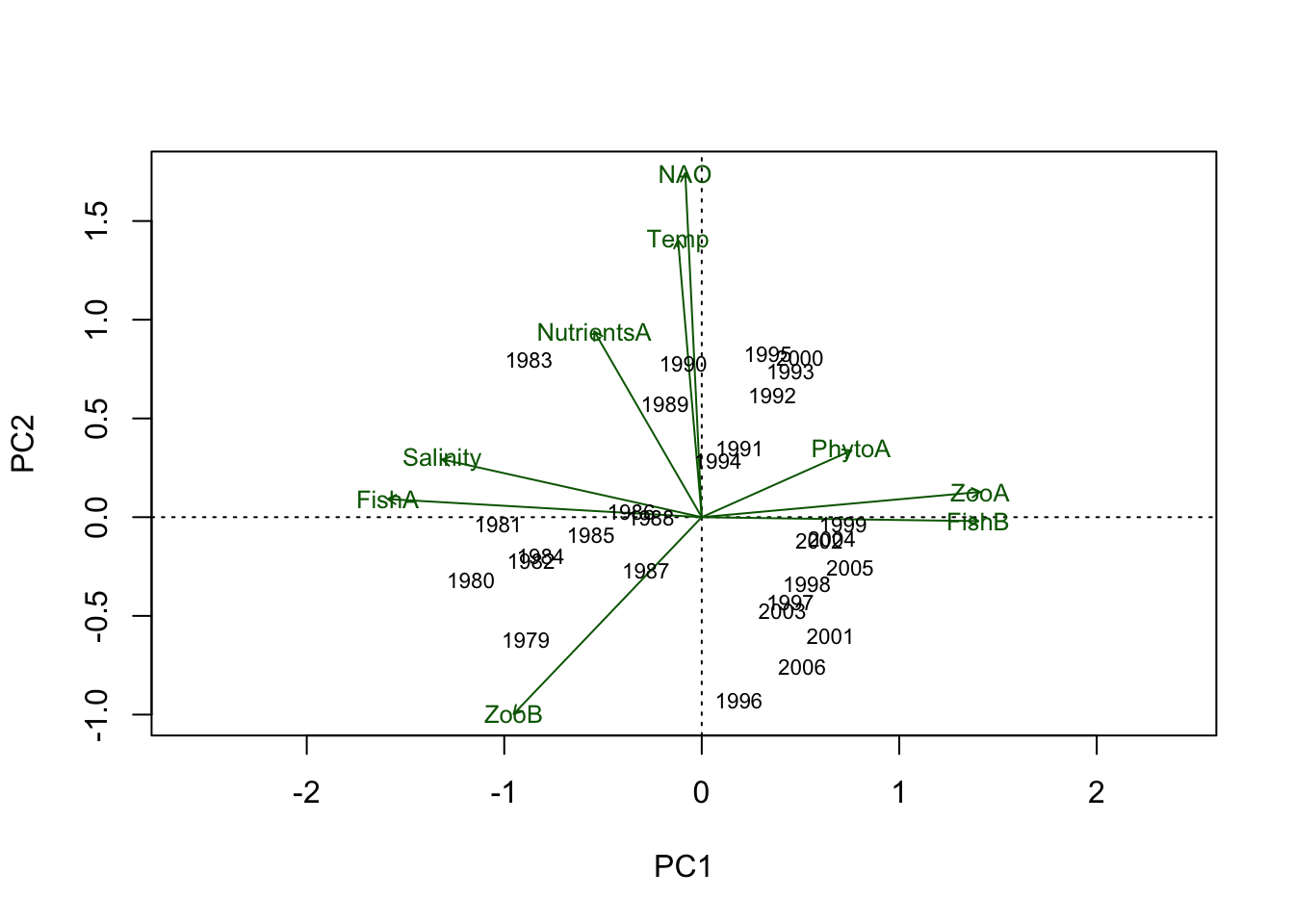
2. Biplot with loadings, time trajectory is in the background:
biplot(PCA.vegan, choices = 1:2, scaling = 3,
       display = c("sites", "species"), type = c("points","none"),
       col = c("darkgreen"))
# Add now the scores with the year label using the same scaling value
text(PCA.vegan, display = "sites", labels = years.char, cex = 0.7,
     col = "grey", scaling = 3)
# For the lines the coordinates of the scaled PC1/2 scores have to be obtained:
scores.sc <- scores(PCA.vegan, scaling = 3)
# Connect the sites in an ascending order of the year
lines(x = scores.sc$sites[, 1][order(Data.transf$Year)],
      y = scores.sc$sites[, 2][order(Data.transf$Year)],
      lty = 1, col = "grey")
# Add the variable names using same scaling value
text(PCA.vegan, display = "species", col = "darkgreen", cex = 0.8,
     scaling = 3)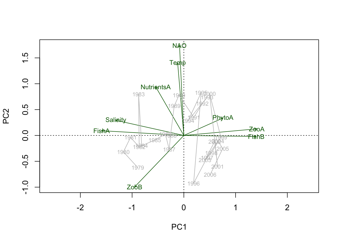
3. Time trajectory plot with the unscaled scores;
In the plot, scores and loadings are not shown (by setting: type = c(“none”,“none”) )
biplot(PCA.vegan, choices = 1:2, scaling = 0,
       display = c("sites", "species"), type = "n")
text(PCA.vegan, display = "sites", labels = years.char, cex = 0.8,
     scaling = 0)
# For the lines the coordinates of the unscaled PC1/2 scores have to be obtained
scores.unsc <- scores(PCA.vegan, scaling = 0)
# Connect the sites in an ascending order of the year
lines(x = scores.unsc$sites[, 1][order(Data.transf$Year)],
      y = scores.unsc$sites[, 2][order(Data.transf$Year)],
      lty = 1, col = "blue")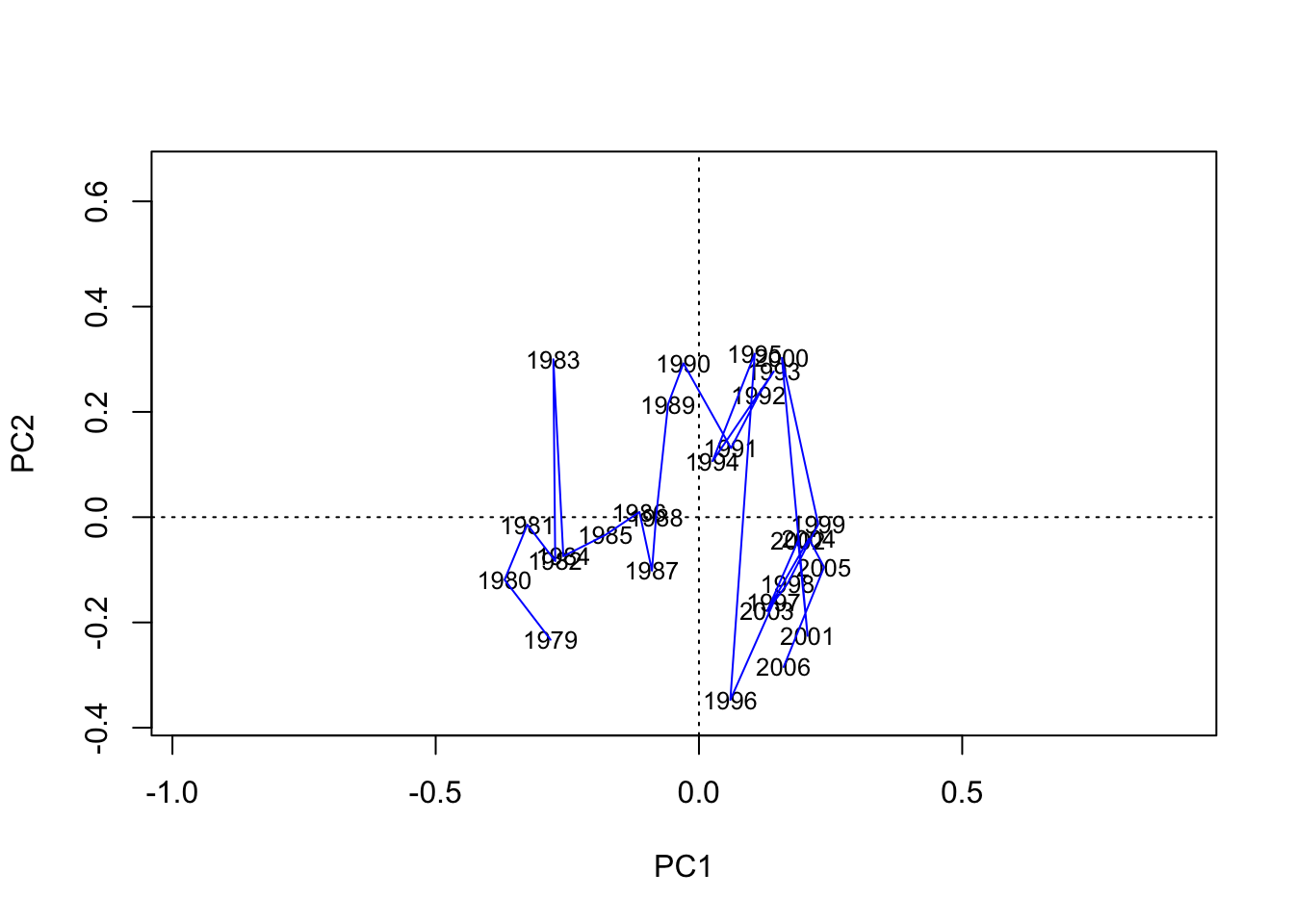
4. Time series plot of PC1 and PC2 scores vs. time
Get unscaled PC1/PC2 site scores from rda() results
scores.unsc <- scores(PCA.vegan, scaling = 0)
# Get the min/max value for the limit of the x- and y-axis
y.low <- min(scores.unsc$sites)
y.upp <- max(scores.unsc$sites)
x.low <- min(Data.transf$Year)
x.upp <- max(Data.transf$Year)

plot(Data.transf$Year, scores.unsc$sites[ ,1], pch = 16,
     ylab = "PC scores", xlab = "Years", axes = FALSE,
     xlim = c(x.low, x.upp), ylim = c(y.low, y.upp), cex = 0.7, cex.lab = 0.9, cex.main = 0.9)
axis(2, cex.axis = 0.7, las = 1)
axis(1, cex.axis = 0.7)
box(col = "black")
abline(h = 0, lty = "dotted")
lines(Data.transf$Year, scores.unsc$sites[, 1], col = "black",
      lwd = 0.8)
points(Data.transf$Year, scores.unsc$sites[, 2],
       pch = 1, cex = 0.7, col = "black", type = "b", lty = 3)
legend("bottomright", legend = c("PC1 scores", "PC2 scores"),
       text.col = c("black", "black"), cex = 0.7,
       col = c("black", "black"),
       pch = c(16, 1), lty = c(1, 3),
       pt.cex = 0.7, bty = "n")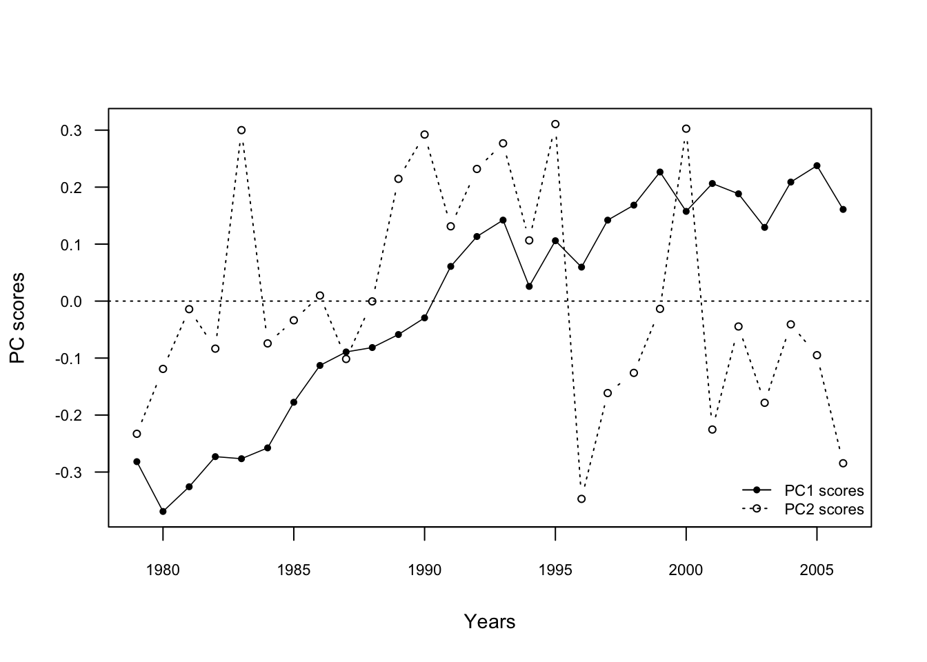
3. Clustering method: Constrained Clustering
Chronological Clustering is not yet available in R. Here we will use a different method designed for spatial data called Constrained Clustering. This method is not recommended for temporal data as it is a hierarchical solution but we can use it here to get a first impression if and when we might expect sudden shifts in the multivariate dataset. To make the results comparable to the PCA we use the same dataset, i.e. Data.transf, and normalise it afterwards
# load packages
library(vegan)
library(rioja)

# Use same data as for PCA, but normalise the data (excl. Year column):
Data.stand <- decostand(Data.transf[ ,-1], method="standardize", MARGIN = 2, na.rm = T)

# Create a separate time vector for labels
Time <- Data.transf$Year

# Save the dimensions (number of rows[1] and columns[2] ) in a vector
n <- dim(Data.stand)

# Calculate the Euclidean distance matrix from the standardised data
# using the stats::dist() function:
Data.dist <- dist(Data.stand, "euclidean",  diag = TRUE, upper = TRUE)


### Constrained hierarchical Clustering as described in "rioja" package:

# Coniss = constrained incremental sum of squares clustering
CC <- chclust(Data.dist, method="coniss")

# plot outcome: Show both plots next to each other
par(mfrow = c(1, 2))
# cluster-plot with labels
plot(CC,labels= Time, main = "Coniss cluster plot", cex=0.8)
# broken stick plot
bstick(CC)
title("Coniss -broken stick plot")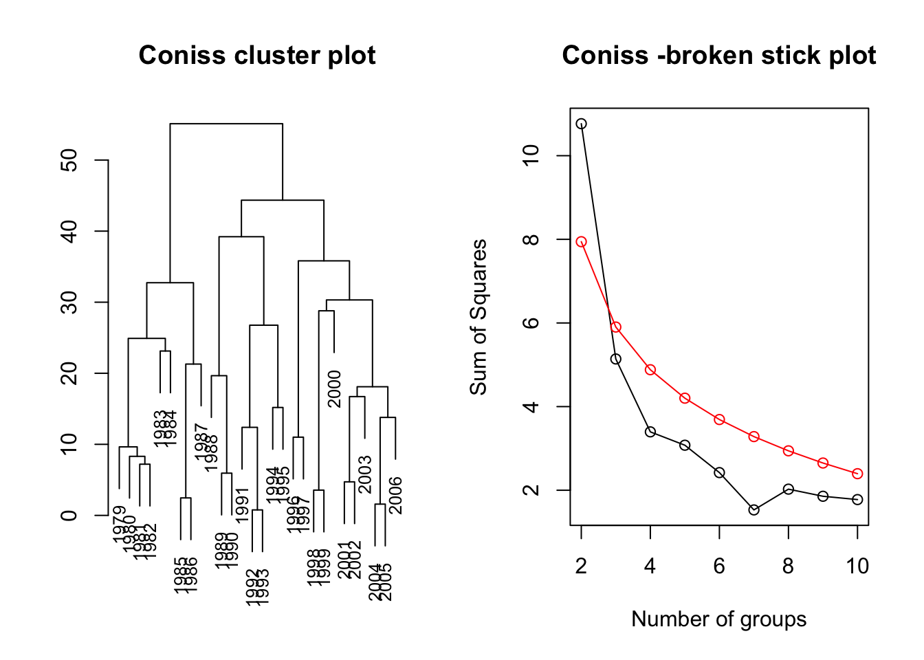
The broken stock plot suggests 1 shift in the joint time series data, i.e. around 1987/1988.
ICES (2010). Report of the ICES/HELCOM Working Group on Integrated Assessments of the Baltic Sea (WGIAB), 19–23 April 2010, ICES Headquarters, Copenhagen, Den- mark. ICES CM 2010/SSGRSP:02. 94 pp.↩
Diekmann, R., Otto, S., and Möllmann, C. (2012). “Towards Integrated Ecosystem Assessments (IEAs) of the Baltic Sea: Investigating Ecosystem State and Historical Development,” in Climate Impacts on the Baltic Sea: From Science to Policy, eds. M. Reckermann, K. Brander, B.R. Mackenzie & A. Omstedt. (Berlin Heidelberg: Springer), 161-199.↩
Planque, B., and Arneberg, P. (2018). Principal component analyses for integrated ecosystem assessments may primarily reflect methodological artefacts. ICES J. Mar. Sci. 75, 1021-1028.↩